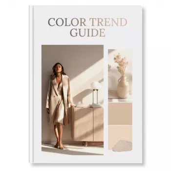
Color Trend Guide (Digital Download): A Practical eBook for Forecasting and Applying Color Across Brand, Web, and Content
Color decisions move faster than mood boards, and “timeless” palettes still need timely context. This digital Color Trend Guide is built for designers, marketers, and creatives who need a clear way to forecast what’s rising, select palettes with confidence, and apply color consistently across real deliverables—from campaigns and social content to packaging and UI.
What This Color Trend Guide Helps You Do
- Turn broad trend signals into usable palette directions (not just inspiration).
- Choose trend-forward colors that still fit brand identity and audience expectations.
- Translate a palette into practical rules for layouts, typography, and imagery.
- Create faster approvals by explaining “why these colors” with a structured rationale.
- Build repeatable workflows for seasonal refreshes and campaign-by-campaign updates.
Who It’s For (and Where It Fits in the Workflow)
- Brand designers: align refreshes and sub-brands to contemporary color directions without breaking recognition.
- Marketers and content leads: define campaign palettes that stay consistent across channels and vendors.
- Freelancers and studios: speed up discovery and presentation with a defensible palette approach.
- Product and UI teams: convert palette ideas into systems that respect hierarchy, contrast, and accessibility.
- Creative strategists: map color shifts to cultural cues, seasonality, and category conventions.
Forecasting Fundamentals: How Color Trends Actually Emerge
Color trends rarely arrive as a single “new shade.” They build through repeated signals, then become familiar enough to feel inevitable. The guide breaks that process down so you can spot direction early without gambling on novelty.
- Macro signals: cultural mood, economic cycles, sustainability narratives, and tech aesthetics can shift color preference over time.
- Micro signals: runway and street style, editorial styling, creator trends, and platform aesthetics accelerate adoption.
- Category gravity: beauty, fashion, home, and tech often influence each other, but adoption speed varies by industry.
- Lifecycle thinking: emerging colors need “bridges” (neutrals, familiar mid-tones) to make them wearable, usable, and brand-safe.
- Evidence-based selection: a trend choice becomes easier to defend when it’s supported by repeat patterns across sources.
For deeper context on how color forecasting is discussed in the industry, references like Pantone Color Institute and The Color Association of the United States (CAUS) provide useful frameworks and historical perspective.
From Forecast to Palette: A Repeatable Selection Method
Trend colors become practical when they’re assigned jobs. Instead of “picking a palette,” you’re building a mini system that can survive handoffs, templates, and production constraints.
- Start with intent: define the outcome (awareness campaign, product launch, rebrand refresh, seasonal drop).
- Anchor with brand constants: identify the colors that must remain stable to preserve recognition.
- Choose a trend driver color: select 1–2 “signal” hues that communicate the current direction.
- Add supporting tones: build harmony with secondaries, tints, shades, and neutrals that control saturation and readability.
- Define usage rules: assign roles (primary, accent, background, functional states) so the palette is actionable.
Palette Roles That Make Trend Colors Usable
| Role |
Purpose |
Common Use Cases |
| Anchor color |
Maintains brand continuity |
Logo lockups, core UI elements, recurring campaign motifs |
| Driver (trend) color |
Signals what’s current and attention-grabbing |
Hero blocks, key visuals, featured product cards |
| Supporting colors |
Expands variety while staying cohesive |
Secondary graphics, icons, backgrounds, illustrations |
| Neutrals |
Control contrast and reduce visual fatigue |
Text, surfaces, spacing, product pages, templates |
| Functional colors |
Communicate status and actions clearly |
Buttons, alerts, success/error states, charts |
Applying Trend Color Across Real Deliverables
- Brand and identity: use trend color as a seasonal layer (campaign system) instead of replacing core brand colors.
- Social content: standardize 3–5 repeatable post templates with clear color roles to keep feeds consistent.
- Web and UI: prioritize contrast and hierarchy; trend colors work best as accents when readability is non-negotiable.
- Packaging and print: account for substrate, finishes, and ink limitations; adjust saturation to avoid muddy output.
- Photography and video: coordinate wardrobe/props with your driver color, then balance with neutrals in backgrounds and type.
For accessibility and contrast planning, the W3C Web Content Accessibility Guidelines (WCAG) Overview is the clearest baseline for color contrast expectations across digital experiences.
Common Mistakes (and Simple Fixes)
Digital Download Details and Best Use
Get the Color Trend Guide (Digital Download)
Ready to turn trend signals into palettes you can actually ship? Start here: Color Trend Guide digital download.
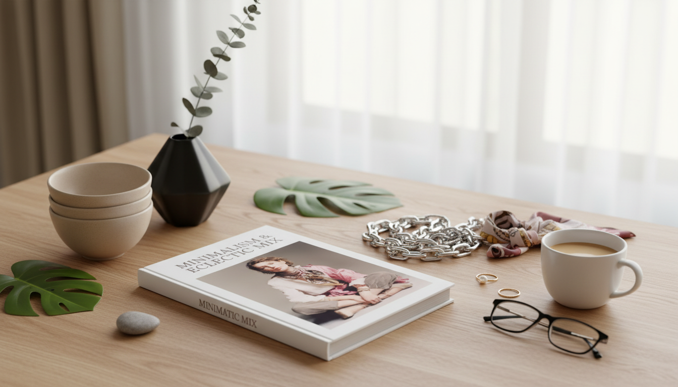
Optional: Build a Quick “Color Study” Kit (In-Stock Picks)
FAQ
How is a trend guide different from a standard brand color palette?
A brand palette is the stable identity system you keep consistent for recognition, while a trend guide adds a seasonal or campaign layer that can change more often. The safest approach is to keep anchor colors dominant and use trend hues as controlled accents with clear roles and ratios.
Can trend colors be used in UI without hurting accessibility?
Yes—trend hues work well as accents when contrast is validated for text and interactive states. Adjusting value and saturation usually solves issues faster than changing hue, and neutrals should carry primary surfaces and body text for reliable readability.
How often should a business refresh campaign colors?
Content-heavy brands often refresh seasonally or quarterly, while product-led brands may do 2–4 major palette moments per year around launches. The best cadence depends on audience expectations, category speed, and how quickly your main channels visually evolve.
Recommended for you










Leave a comment